
✦ ENTERPRISE DESIGN SYSTEMS & TOKEN ARCHITECTURE

Build Faster with a Design System That Keeps Everything in Sync

We help you create scalable design systems that bring your Figma designs, reusable components, and development workflows together. Keep your website, apps, and digital products consistent while making design and development faster and easier.
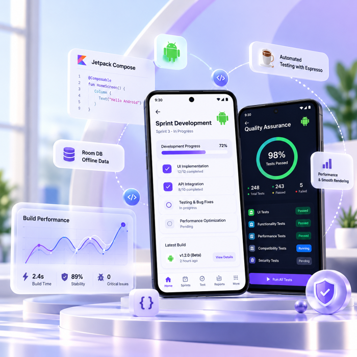
Unified Design Tokens • Reusable Components • Consistent UI Across Platforms
Enterprise Design System & Token Architecture
✦ BRINGING DESIGN & DEVELOPMENT TOGETHER

Turn Design Chaos into a Consistent, Scalable System

As your digital products grow, keeping designs, components, and code consistent becomes harder. We help you bring everything together with a unified design system that simplifies collaboration, reduces repeated work, and keeps every product experience aligned as your business grows.

WITHOUT A UNIFIED DESIGN SYSTEM

When Design Inconsistency Slows Your Growth

As your product grows, different teams create their own styles, duplicate components, and make inconsistent design decisions. This leads to:

  • Accessibility Gaps Unchecked contrast, missing ARIA labels, and inconsistent standards.
  • Inconsistent User Experiences Visual differences and unexpected UI issues with every update.
  • Repeated Development Work Teams rebuilding components that already exist.
  • Scattered Brand Colors Different color codes across your application.
WITH IT INFONITY'S DESIGN SYSTEM

One Design System. Every Platform. Complete Consistency.

We bring your designs and development together with shared design tokens, reusable components, and automated workflows that keep every platform aligned as your product evolves.

  • Unified Design Tokens Consistent styles across web, iOS, Android, and email.
  • Automated Figma-to-Code Sync Keep design updates connected to development.
  • Reliable Visual Consistency Catch UI differences through automated visual testing.
  • Accessibility-Ready Components Build with WCAG standards and automated accessibility checks.
✦ OUR DESIGN SYSTEM ARCHITECTURE

Four Layers That Bring Your Design System Together

We build every design system around four connected layers, bringing your designs, components, and code together for a consistent experience across all platforms.

01 DESIGN FOUNDATION

Design Tokens & Flexible Brand Theming

We create a shared foundation for your colors, typography, spacing, and visual styles. Using standardized design tokens, we keep your brand consistent and make it easy to apply design updates across web, iOS, and Android.

Explore Design Foundations
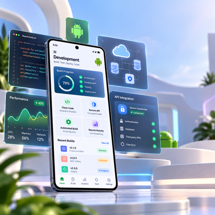
W3C Design Token Engine and Multi-Brand Theming
02 DEVELOPMENT

Reusable Components Across Every Platform

We build accessible, reusable UI components for React, Vue, iOS, and Android. With consistent styling and built-in accessibility, your teams can develop faster while delivering a seamless experience across every platform.

Explore UI Development
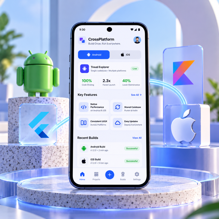
Cross-Platform Component Engineering
03 DOCUMENTATION

Interactive Documentation & Component Library

We create easy-to-use documentation where your team can explore live components, understand design rules, and access updated specifications all in one place. This makes collaboration smoother and helps new team members get started faster.

Explore Design Documentation
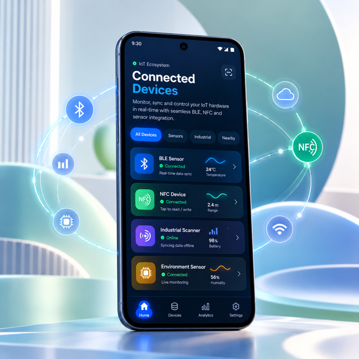
Living Documentation & Storybook 8 Portals
04 GOVERNANCE & AUTOMATION

Automated Testing & Design System Updates

We keep your design system reliable and up to date with automated visual testing, version control, and smooth component updates helping your development teams maintain consistency without disrupting ongoing work.

Explore CI/CD Workflows
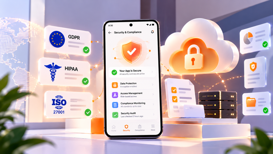
Automated CI/CD Governance & Versioning
✦ SEAMLESS DESIGN-TO-CODE AUTOMATION

From Figma to Code, Without the Manual Work.

Turn every Figma design update into production-ready code, keeping your design system consistent, connected, and always in sync.

Step 01

Figma Variables

Keep your design system up to date. Designers can easily update colors, spacing, and border-radius values directly in Figma.

Step 02

Automated Git Sync

Every design change automatically syncs as W3C-compliant JSON through GitHub pull requests.

Step 03

Multi-Platform Token Compilation

Convert design tokens into ready-to-use CSS, TypeScript, Swift, and Jetpack Compose code.

Step 04

Automated Visual Testing

Catch visual inconsistencies early with Chromatic-powered regression testing on every pull request.

Step 05

Seamless Package Releases

Automatically publish versioned design system packages to NPM, CocoaPods, and Maven.

✦ OUR DESIGN SYSTEM TECHNOLOGY STACK

Built with the Right Tools. Ready to Scale.

We bring together modern design standards, cross-platform technologies, interactive Storybook environments, and automated CI/CD workflows to create consistent, scalable, and future-ready design systems.

Our Design System Toolkit

Figma Enterprise

Tokens Studio

Style Dictionary 4

W3C DTCG

Supernova

Specify

What Powers Our Design Systems

100% W3C-Compliant Tokens

One consistent source of truth across your design ecosystem.

Living Storybook Documentation

Interactive component libraries that stay updated with every change.

Automated Visual Quality Checks

Catch UI inconsistencies early with Chromatic visual testing.

Cross-Platform Development

Reusable design tokens for React, SwiftUI, Jetpack Compose, and Flutter.

Our Frontend Technology Stack

React

TypeScript

Vue 3

Next.js

Tailwind CSS

Radix UI Primitives

Built for Modern Frontend Experiences

Reusable UI Components

Create consistent, flexible components across your applications.

Type-Safe Development

Build reliable, maintainable interfaces with TypeScript.

Modern Framework Integration

Deliver seamless experiences with React, Vue 3, and Next.js.

Scalable Styling & Accessibility

Combine Tailwind CSS and Radix UI for flexible, accessible interfaces.

Our Cross-Platform Technology Stack

iOS SwiftUI

Android Jetpack Compose

Kotlin Multiplatform

Apple Swift

React Native

Flutter

Designed for Every Platform

Native iOS Experiences

Build seamless, high-performance interfaces with SwiftUI and Swift.

Modern Android Development

Create intuitive, consistent UI experiences with Jetpack Compose.

Shared Cross-Platform Architecture

Maximize code reuse with Kotlin Multiplatform, React Native, and Flutter.

Consistent Design Everywhere

Deliver unified user experiences across mobile platforms.

Our Documentation & Component Ecosystem

Storybook 8

Zeroheight

Docusaurus

VitePress

MDX

Backstage

Documentation That Grows with Your Product

Interactive Component Libraries

Explore and test reusable UI components with Storybook.

Centralized Design Documentation

Keep design guidelines, patterns, and standards accessible in one place.

Developer-Friendly Knowledge Hubs

Simplify technical documentation with Docusaurus, VitePress, and MDX.

Unified Engineering Portal

Bring tools, services, and developer workflows together with Backstage.

Our Quality Assurance & CI/CD Stack

Chromatic

GitHub Actions

Axe Core

Playwright

Changesets (SemVer)

ESLint & Stylelint

Quality Built into Every Release

Automated Visual Testing

Catch UI differences early with Chromatic-powered regression checks.

Continuous Integration & Delivery

Automate testing, validation, and deployment with GitHub Actions.

Accessibility & Browser Testing

Validate WCAG standards and cross-browser experiences with Axe Core and Playwright.

Consistent Code & Version Control

Maintain clean code and reliable package releases with ESLint, Stylelint, and Changesets.

✦ INDUSTRY-FOCUSED DESIGN SYSTEMS

Design Systems Built Around Your Industry.

We create tailored design systems with reusable components, adaptable layouts, and built-in accessibility to meet your industry's unique needs and deliver seamless user experiences.

FINTECH & NEOBANKING

Trading Dashboards & Financial Data Systems

Build powerful financial interfaces with precise data layouts, real-time numerical displays, and flexible white-label components designed for trading platforms and digital banking experiences.
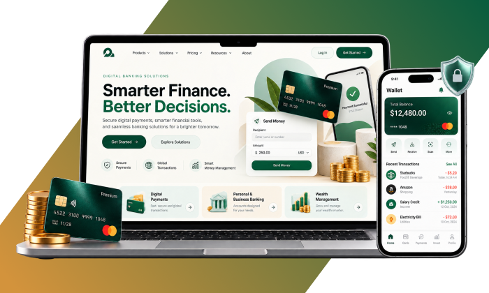
FinTech and Neobanks Design Systems
78% Fewer Front-End Trading UI Defects
CLINICAL HEALTHCARE & MEDTECH

Safer, Smarter Healthcare Interfaces

Create clinician-friendly EHR experiences with clear visual layouts, safer prescription workflows, and accessibility-focused components that support better usability across healthcare environments.

Healthcare and MedTech Design Systems
100% VPAT Accessibility Audit Score
ENTERPRISE B2B SAAS

Consistent Experiences Across Every Team

Bring your product experience together with reusable components, intuitive data tables, flexible filters, and role-based interfaces that help multiple development teams build faster and stay visually aligned.
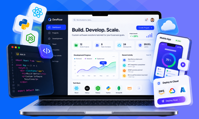
Enterprise B2B SaaS Design Systems
65% Faster Sprint Feature Delivery
OMNICHANNEL E-COMMERCE

Seamless Shopping Experiences That Convert

Create engaging shopping journeys with smooth interactions, localized pricing, flexible campaign designs, and lightning-fast experiences across every device.

Omnichannel E-Commerce Design Systems
+24% Higher Mobile Checkout Completion
AUTOMOTIVE & COCKPIT HMI

Intuitive In-Vehicle Digital Experiences

Design driver-friendly interfaces with easy-to-use touch controls, eye-comfortable night modes, and smooth 60 FPS performance across digital dashboards and embedded displays.
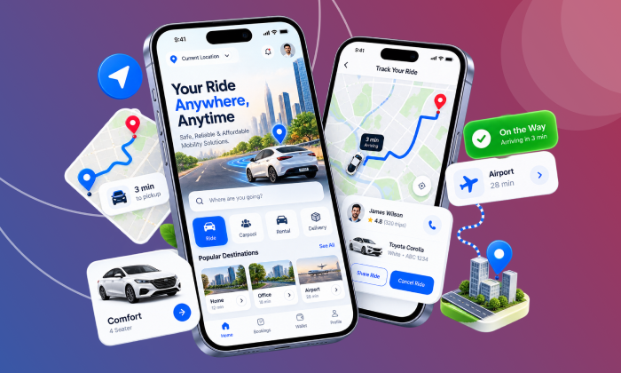
Automotive and Cockpit HMI Design Systems
60 FPS Smooth Performance on Embedded Displays
TELECOM & SUPER-APPS

Seamless Digital Experiences at Scale

Build connected digital experiences with unified design systems for subscriber self-service, broadband diagnostics, and mobile retail platforms making everyday interactions simpler for millions of users.
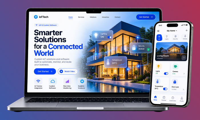

Telecom and Super-Apps Design Systems
85M+ Monthly Active Users Supported
✦ LIVE BRAND TRANSFORMATION

Experience Instant Brand Morphing

Click below to see how swapping a single token configuration instantly morphs the interface geometry, colors, and typography.

Apex Capital: Institutional Finance

Calibrated for maximum data density, compact 6px border radii, high contrast, and rapid tabular scanning across trading books.

Primary Token: #FB8B3C
Corner Radius: 6px
Information Density: Compact (4px)
INSTITUTIONAL TIER VERIFIED

Portfolio Balance

$4,850,220.00
✦ OUR DESIGN SYSTEM IMPLEMENTATION APPROACH

A Proven 4-Stage Roadmap to Design System Success

From strategy and architecture to development and adoption, we build and integrate scalable design systems without disrupting your team’s ongoing workflows.

STAGE 01

UI Audit & Design Discovery

We review your existing UI, identify inconsistent colors, styles, and duplicate components, and map out a clear structure for a unified design system.

Weeks 1 – 2 • Discovery & Audit
STAGE 02

Building Your Design Token Foundation

We create a structured token system with consistent colors, typography, and spacing, then automate its conversion into reusable code across your platforms.

Weeks 3 – 4 • Architecture & Foundation
STAGE 03

Developing Your Core UI Components

We build 20+ reusable, accessible UI components with TypeScript, built-in ARIA support, automated testing, and interactive Storybook documentation.

Weeks 5 – 8 • Development & Testing
STAGE 04

Launching & Scaling Across Teams

We integrate your design system into active development workflows, automate visual testing and package releases, and help your teams adopt it confidently through hands-on training.

Weeks 9 – 12 • Launch & Adoption
✦ TEAM COLLABORATION & GOVERNANCE

A Design System Your Entire Team Can Shape.

We make collaboration simple with an open RFC process that gives every team a voice in design decisions while keeping components consistent, scalable, and aligned across your organization.

Discuss Governance Architecture
1

Submit an RFC Proposal

Any designer or developer can suggest a new component or token update through a GitHub issue.

2

Collaborative System Review

Our core team reviews each proposal for reusability, accessibility, and consistency across projects.

3

Design & Development

Approved components move from Figma into Storybook, where teams can review and test them before release.

4

Automated Release & Deployment

Chromatic validates visual changes, Changesets manages versioning, and approved packages are automatically published to NPM.

✦ MEASURABLE BUSINESS RESULTS

Real Impact. Measurable Results

See how our enterprise design systems help businesses accelerate development, improve product consistency, and achieve measurable results across their digital experiences.

65%
Faster Sprint Delivery

Help teams move from ideas to launch faster. A unified W3C design token architecture brought 18 global FinTech product teams together, reducing UI rework by over 40 hours per squad every sprint.

Zero
Visual Regressions in QA

Deliver consistent experiences with confidence. Automated Chromatic visual testing across every PR helped a HealthTech SaaS platform eliminate cross-browser inconsistencies and regression issues.

100%
Web & Mobile Token Consistency

One brand experience across every platform. A unified design token system aligned React Web, iOS SwiftUI, and Android Jetpack Compose, ensuring seamless visual consistency across the enterprise logistics ecosystem.

✦ YOUR QUESTIONS, ANSWERED

Enterprise Design System FAQs

Explore the technical details, architectural decisions, and implementation insights behind our enterprise design system solutions from scalable token architectures to cross-platform consistency and long-term governance.

A UI Kit is merely a set of static drawings in Figma. A true Design System is production software: it synchronizes design tokens via Git pull requests, exports typed component packages for React, Vue, iOS, and Android, provides living Storybook 8 documentation, and enforces automated visual regression testing.

We integrate Figma Variables and Tokens Studio with GitHub webhooks. When token updates are published in Figma, a GitHub Action creates a new pull request containing the W3C JSON token updates. Style Dictionary compiles these tokens into CSS, TypeScript, and native mobile assets, and Chromatic runs visual diffs before merging.

Yes. Through Style Dictionary multi-platform transforms, our design tokens compile into web CSS custom properties, iOS Swift tokens, and Android Jetpack Compose Kotlin objects. We also engineer cross-platform React Native libraries or parallel native component sets adhering to the exact same token contracts.

Our token taxonomy strictly separates Global Primitives from Semantic Aliases. To launch a new white-label brand or client skin, the core component library remains completely untouched; only a brand-specific token package is swapped, instantly updating colors, radii, elevations, and fonts across the entire application.

Every release is governed by Semantic Versioning (SemVer) with Changesets and Chromatic automated visual snapshot tests. When breaking changes are required, we supply automated AST codemod scripts that automatically refactor deprecated components across all consuming squad codebases.

A foundational design system with 20 essential components, W3C tokens, Figma library, and Storybook documentation is typically production-ready within 6 to 8 weeks. Comprehensive multi-brand enterprise systems with native mobile SDKs and CI/CD automation typically follow our 12-week deployment framework.

✦ UNIFY YOUR ENTIRE PRODUCT ECOSYSTEM

Build Once. Scale Everywhere. Accelerate Delivery by 65% with ITinfonity.

Bring consistency, speed, and scalability to your product ecosystem. Schedule a 45-minute technical consultation with ITinfonity’s Design Systems experts. We’ll assess your existing UI challenges, identify opportunities for improvement, and create a practical modernization roadmap tailored to your business goals.

Copyright © 2026 Powered by IT infonity | All rights reserved
✕
🎬

Demo Video In production, your actual product demo video would play here.
Embed a YouTube, Vimeo, or self-hosted video.

✕

Partner with IT Infonity for Business Success!

Our product experts will walk you through a personalized demo and help you find the perfect solution for your needs.

📅
30-minute focused session
🎯
Tailored to your industry
💡
Live Q&A with our experts
💰
Free — no credit card needed
âš¡
Confirmation within 2 hours

Book Your Free Demo

Fill in the details below and we'll get back to you shortly.


      Join Our Team

      Join Our Team

      Take the next step in your career with IT Infonity.

      Apply Now